


 kradcliffe
@Rune,
Would it be possible for the "latest posts" button to highlight blue if you have new unread posts or stay grey if there are none since the last visit?
Thank you.
Would it be possible for the "latest posts" button to highlight blue if you have new unread posts or stay grey if there are none since the last visit?
Thank you.
Posté Thu 25 Feb 16 @ 1:54 pm
") Rune (DJ-In-Norway)
Rune (DJ-In-Norway)
Good idea, will see if i can sort something like that
Posté Thu 25 Feb 16 @ 2:15 pm
 locoDog
if i try view recent posts when i'm also not logged in. i get 'the link is no longer valid' page.
is this by design or because 'recent posts' is linked with, 'my posts' and 'my threads'
logging in is no hardship, i'm just curious is atomix aware of the state of play/
is this by design or because 'recent posts' is linked with, 'my posts' and 'my threads'
logging in is no hardship, i'm just curious is atomix aware of the state of play/
Posté Thu 25 Feb 16 @ 5:06 pm
Rune (DJ-In-Norway)
its by design..
It might change though, if we want the focus/welcome/start page to be more a "wall stream" of recent posts instead of the traditional board forum way.. .
For now its for logged in users only ;)
It might change though, if we want the focus/welcome/start page to be more a "wall stream" of recent posts instead of the traditional board forum way.. .
For now its for logged in users only ;)
Posté Thu 25 Feb 16 @ 5:56 pm
kradcliffe
So set the button only to appear when a user is logged in.
Posté Thu 25 Feb 16 @ 6:16 pm
Rune (DJ-In-Norway)kradcliffe wrote :
So set the button only to appear when a user is logged in.
thats already the case, of course ;)
Posté Thu 25 Feb 16 @ 6:22 pm
kradcliffe
Buttons have now changed shape and they are taking up more space in IE, but in Chrome they are OK.
[dj-in-norway : should be fixed now, IE is tricky as it doesnt follow web standards ]
[dj-in-norway : should be fixed now, IE is tricky as it doesnt follow web standards ]
Posté Thu 25 Feb 16 @ 6:51 pm
kradcliffe
Cheers Rune, now fixed.
Posté Fri 26 Feb 16 @ 1:36 pm
Rune (DJ-In-Norway)Good good ;) IE is a nightmare .. lol
Posté Fri 26 Feb 16 @ 1:37 pm
kradcliffe
The space allowed for replying to private messages is far too small. (Windows, IE11)
Posté Sat 27 Feb 16 @ 6:53 pm
 groovindj
Ditto here on Firefox with Windows 7.
Posté Sat 27 Feb 16 @ 7:22 pm
locoDog
firefox i can expand the box
Posté Sat 27 Feb 16 @ 7:42 pm
 pseft
pseft
nice layout... i noticed that "MY TOPICS" date back to only "2015" and "MY POST"
i guess you cant date back to the beginning of registering ?
i guess you cant date back to the beginning of registering ?
Posté Sun 28 Feb 16 @ 3:41 am
groovindjlocodog wrote :
firefox i can expand the box
Oh yeah - there's a tiny little barely visible triangle at the lower right corner that can be grabbed and dragged.
I'd never have noticed if you hadn't mentioned it!
@web devs any chance of making that more prominent/obvious? Adding a message to indicate that box can be sized?
Posté Sun 28 Feb 16 @ 9:53 am
kradcliffe
Definitely can't be expanded on IE11
Posté Sun 28 Feb 16 @ 9:55 am
groovindj
@kradcliffe is there any particular reason you're still using IE? I dumped it a few years ago.
As Rune said earlier, it doesn't run with the pack. It's the lone sheep that's lost its way. Too many cooks spoil the broth. Oh no, that's something else.
As Rune said earlier, it doesn't run with the pack. It's the lone sheep that's lost its way. Too many cooks spoil the broth. Oh no, that's something else.
Posté Sun 28 Feb 16 @ 10:02 am
kradcliffe
I've used IE since Windows '95 and it's never caused me any problems. Have tried various alternative browsers in the past but just keep going back to IE.
Irrespective of a particular browser's quirks, websites should be developed to cover full compatibility.
Irrespective of a particular browser's quirks, websites should be developed to cover full compatibility.
Posté Sun 28 Feb 16 @ 10:09 am
Rune (DJ-In-Norway)Dont worry ;) the box at pm will be fixed. It was just an oversight..
Zero problem to fix for IE ;)
Posté Sun 28 Feb 16 @ 11:27 am
 PachN
PachN
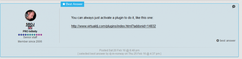
If you are not at the end of a topic i.e. if there are more pages, there is no "new message" button.
is this by design?
Is this a new feature?
Will everybody be possible to mark an answer as best answer?
If not, will everybody be possible to remove best answers like you can see in the pic.
is this by design?
Is this a new feature?
Will everybody be possible to mark an answer as best answer?
If not, will everybody be possible to remove best answers like you can see in the pic.
Posté Mon 29 Feb 16 @ 10:54 am
kradcliffe
Looks like a nicer way for teamers to lock posts basically. But then if there is an answer that closes the post there's no point in it being left open anyway.
In the longer term it will stop people using Google searches and dragging up 7 year old irrelevant posts.
In the longer term it will stop people using Google searches and dragging up 7 year old irrelevant posts.
Posté Mon 29 Feb 16 @ 11:00 am