Discussion about Project X
Posté Tue 07 Jul 20 @ 12:00 pm
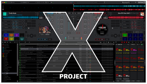
Great Skin Dan! After using FRUiT skin so many years i finally found the ultimite layout!!! Amazing job! Virtual DJ Devs: take notice!!! :)
Posté Tue 07 Jul 20 @ 4:38 pm
I hope you got the approval of these three...

1987 movie called Project X (good film)

1987 movie called Project X (good film)
Posté Tue 07 Jul 20 @ 4:56 pm
The one on the right said it was ok. ;)
Posté Tue 07 Jul 20 @ 4:56 pm
Awesome work Dan, thank you so much!
Posté Tue 07 Jul 20 @ 5:18 pm
Godsend...what an interface...
Posté Wed 08 Jul 20 @ 12:44 am
Wowsers Dan! You've been busy! You've done a superb job on this skin, it is excellent. My new goto skin. :-)
Posté Wed 08 Jul 20 @ 3:05 am
Dan,
You really hit it out of the park!
Thx
GK
You really hit it out of the park!
Thx
GK
Posté Wed 08 Jul 20 @ 6:46 am
Congratulations Dan !
This is absolutely the best skin done since Pierre "Fruit" did his one.
I hope you dont take my questions negatively, but I would like to point out my view what I am missing and need to go from Fruits skin to yours.
Perhaps I have missed some tweeks but here it goes anyway ;)
1. I would like to have a clearer separated lines between the decks and mixer (this is just my aesthetic side ;)
2. More visibility (white) for the pitch and pitchlock on other colors than default.
3. Missing visually the "Aux" button on deck (I use it with microphone on broadcasting usualy on channel 4).
4. Would like to an easier way to save loops directly from the loop window instead of clicking between loop, simple loop, loop adjust etc..
5. When changing the skin with color picker the sampler goes to the same color as choosen, could we get the default black as browser background?
6. I would like to have some more custom buttons on the top like fruitskin.
7. Option with video crossfader is good, but I would like to have separated one for video, using videofader with mouse a lot when brodcasting.
8. Visible EQ kill buttons beside the knobs.
Posté Wed 08 Jul 20 @ 5:00 pm
Always happy to have feedback. But please remember this is not fruits skin. Whilst I'm happy to implement features that are useful and beneficial for all. Adding things because 'thats how fruit did it' is not what I'm here for.
That said some valid comments and I've answered them below.
:-)
That said some valid comments and I've answered them below.
:-)
freppa wrote :
1. I would like to have a clearer separated lines between the decks and mixer (this is just my aesthetic side ;) - will be slightly bolder in next build
2. More visible lines (white) for the pitch. - will be slightly bolder in next build
3. Missing visually the "Aux" button on deck (I use it with microphone on broadcasting usualy on channel 4). - can be done already using custom buttons. But will see if I can fit it in to the mini decks
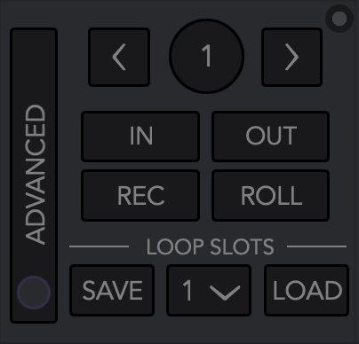
4. Would like to an easier way to save loops directly from the loop window instead of clicking between loop, simple loop, loop adjust etc.. - will look at adding an alternative loop view with key functions in next build
5. When changing the skin with color picker the sampler goes to the same color as choosen, could we get the default black as browser background? - option available in next build so browser remains 'greyscale' and ignores skin theme color
6. I would like to have some more custom buttons on the top like fruitskin. - then skin has a total of 48 custom button/sliders, 24 on each deck which are mirrored by default. But can be split into 'per deck' in the menu options under deck. So unlikely I'll add more at the moment
7. Option with video crossfader is good, but I would like to have separated one for video, using videofader with mouse a lot when brodcasting. - already available when you set the video crossfader to manual/seperate
8. Visible EQ kill buttons beside the knobs. - will look at possibly adding in a future build
Posté Wed 08 Jul 20 @ 5:30 pm
Thank you for taking feedback the right way ;)
I think this will be the replaceable skin for the fruitskin users and 2021 versions.
6. I hope that you will see how much visibilaty is worth with some extra buttons on the top.

I think this will be the replaceable skin for the fruitskin users and 2021 versions.
6. I hope that you will see how much visibilaty is worth with some extra buttons on the top.

Posté Wed 08 Jul 20 @ 5:53 pm
@Freppa,
Out of curiosity, how many custom buttons do you use? Can you post some of them as an example?
I'm asking because this skin has so many features added that it kinda eliminates the need for custom buttons. Nonetheless, you do get visually all the time 6 buttons on each side and then another 30 behind the effects and pad section...
Dig in a little bit in the skin and you'll be surprised with that you find ;)
Posté Wed 08 Jul 20 @ 7:01 pm
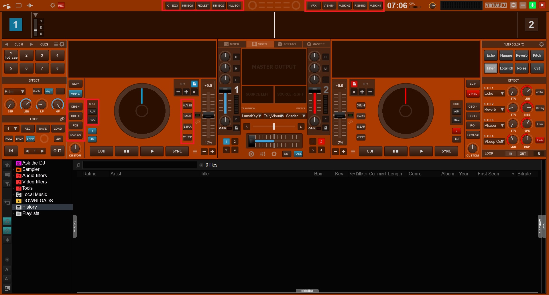
Ok, so I caved in. Custom buttons on the top bar are optional in the next build.

It meant I had to move sandbox, but its all in.
The buttons are slightly smaller than in fruits skin. But I was nice and used the same button numbers, so you won't even have to reprogram them :-)


It meant I had to move sandbox, but its all in.
The buttons are slightly smaller than in fruits skin. But I was nice and used the same button numbers, so you won't even have to reprogram them :-)

Posté Wed 08 Jul 20 @ 9:44 pm
New loop layout in next build


Posté Wed 08 Jul 20 @ 11:43 pm
Dan (djtouchdan) wrote :
Ok, so I caved in. Custom buttons on the top bar are optional in the next build.

It meant I had to move sandbox, but its all in.
The buttons are slightly smaller than in fruits skin. But I was nice and used the same button numbers, so you won't even have to reprogram them :-)


It meant I had to move sandbox, but its all in.
The buttons are slightly smaller than in fruits skin. But I was nice and used the same button numbers, so you won't even have to reprogram them :-)

Wow not that I didn't want this as well :P but its nice to have options! An already perfect skin got "perfecter" lol
Posté Thu 09 Jul 20 @ 12:54 am
PressNPlayDJ wrote :
@Freppa,
Out of curiosity, how many custom buttons do you use? Can you post some of them as an example?
I'm asking because this skin has so many features added that it kinda eliminates the need for custom buttons. Nonetheless, you do get visually all the time 6 buttons on each side and then another 30 behind the effects and pad section...
Dig in a little bit in the skin and you'll be surprised with that you find ;)
Out of curiosity, how many custom buttons do you use? Can you post some of them as an example?
I'm asking because this skin has so many features added that it kinda eliminates the need for custom buttons. Nonetheless, you do get visually all the time 6 buttons on each side and then another 30 behind the effects and pad section...
Dig in a little bit in the skin and you'll be surprised with that you find ;)
Thank you Dan for being so responsive.
Here is some of my custom buttons, as you can see I put different functions on the custom buttons on different sections of the skin.
I use the top right for videoskins, example: setting "videoSkin" '' ? setting "videoSkin" 'Title GFX 1:Red-Light Modern Arty [no remix - with coverart]' : setting "videoSkin" ''
The top left is used for video and audio kill, example: deck 1 mute & video_level 0% ? video_level 100% : video_level 0%
The request button on top left is used for Askthedj, example: get_askthedj_unread ? blink 250ms : param_equal `get_browsed_folder` "Ask the DJ" ? goto_last_folder : browser_gotofolder "Ask the DJ"
My buttons on outside of the jogweel in the player section is used for quickly moving CBGs mostly, example: deck 1 adjust_cbg -0.01
The buttons inside of the jogweel am I using for video effects like bars, sidebars, outline and videofilter (colorfx) that is great to work with filter knob, example: effect_active "VFilter"

Posté Thu 09 Jul 20 @ 5:29 am
PressNPlayDJ wrote :
Out of curiosity, how many custom buttons do you use? Can you post some of them as an example?
I'm asking because this skin has so many features added that it kinda eliminates the need for custom buttons.
I'm asking because this skin has so many features added that it kinda eliminates the need for custom buttons.
I use them for controlling my DMX lighting. I asked Babis to add a second row of 16 in the Blocks skin which has a custom button panel that's a great idea for that sort of thing.

Posté Thu 09 Jul 20 @ 6:51 am
additionaly to dmx, there are many unthinkable scripts used for composite or chained effects and actions, automation, settings, debug ...
there are never enough custom buttons and many unused (depending on dj) functions in any skins
all custom buttons having tenth of actions each
there are never enough custom buttons and many unused (depending on dj) functions in any skins
all custom buttons having tenth of actions each
Posté Thu 09 Jul 20 @ 7:31 am
kradcliffe wrote :
I use them for controlling my DMX lighting. I asked Babis to add a second row of 16 in the Blocks skin which has a custom button panel that's a great idea for that sort of thing.

PressNPlayDJ wrote :
Out of curiosity, how many custom buttons do you use? Can you post some of them as an example?
I'm asking because this skin has so many features added that it kinda eliminates the need for custom buttons.
I'm asking because this skin has so many features added that it kinda eliminates the need for custom buttons.
I use them for controlling my DMX lighting. I asked Babis to add a second row of 16 in the Blocks skin which has a custom button panel that's a great idea for that sort of thing.

Nice feature of the skin and DMX control !
Would be nice if Dan could add a new rack for more custom buttons like that one and same size as 6 decks rack ;)
The way I feel about using good skins is to have as many visual functions that I use in one layout, and I mostly do videos.
Posté Thu 09 Jul 20 @ 2:41 pm
Ok i see.. you do know that some of that stuff can be mapped on your controller right? Just an idea... I use a denon mc6000 mk2 and i have a shift button on the controller so I've mapped secondary function using the shift button. The ask the DJ notification, i think there is already something in the skin. If not, that could be an interesting add on as an option... Still though, for those who are used to FRUiT skin you'll like this one even better. It has more custom buttons than FRUiTs and is visually more appealing in my opinion. I used to use 24 custom buttons and this skin has help reduce them to 10 max which is awesome already
Posté Thu 09 Jul 20 @ 4:28 pm


