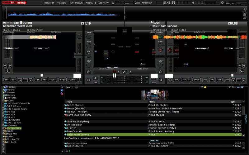
Wow just downloaded and tried the skin and love it.
Would be great if the "ext mixer" mode allowed you to turn on the rhytm panel at the top just like you can in the "audio mode" by clicking on the arrow. Think if you could do this it would be just about perfect :)
Really good job on this by the way
Would be great if the "ext mixer" mode allowed you to turn on the rhytm panel at the top just like you can in the "audio mode" by clicking on the arrow. Think if you could do this it would be just about perfect :)
Really good job on this by the way
Posté Tue 12 Mar 13 @ 11:26 pm
Been playing around with this skin and the more i do the more i like it , really really impressed.
Just one small thing i noticed on the "audio mode" that shows the rhythm panel though. In the display windows the time remaining shows next to the jogwheel but on the right deck it shows the time elapsed next to the jogwheel. Everything else in the display is perfectly mirrored.
Brilliant job and really enjoying it so far.
Posté Tue 12 Mar 13 @ 11:56 pm
Love the skin, well done, now before I decide to ditch vmix for good would it be possible to have the video window selector available on all three windows.
The reason I ask is that I prefer the centre window to be used fully for video output with no info showing and left and right windows for time remaining, cueing up etc.
Thanks and nice work.
The reason I ask is that I prefer the centre window to be used fully for video output with no info showing and left and right windows for time remaining, cueing up etc.
Thanks and nice work.
Posté Tue 19 Mar 13 @ 1:27 pm
Very nice work!!!
Posté Wed 20 Mar 13 @ 7:10 pm
Hey Dan, hows the progress on your new skin coming along.
(Not wanting to be rude, just saying hello).
(Not wanting to be rude, just saying hello).
Posté Wed 20 Mar 13 @ 8:05 pm
Super skin but problem with VDJ 7.4 .png)
.png)
Posté Fri 22 Mar 13 @ 6:49 am
This skin should be the default for Virtual DJ, clean, modern and fresh. Great work! can't wait for 1280*800 version
Posté Sat 06 Apr 13 @ 1:10 pm
Very nice skin DJ Lunatico, great job!
Quick request if you don't mind.
I'm using it with Numark Cue and the "Cue" logo overlaps with "Virtual DJ" logo that is already in your BMP file.
I think the VDJ or Cue automatically display the logo depending on the position that you define them in the XML file, so maybe you can just remove the "Virtual DJ" logo in the BMP files to avoid overlap with Cue logo?
Thanks.
Posté Wed 26 Jun 13 @ 12:55 am
Any chance you can do a version like this with decks that are from left to right both sides.


Posté Fri 28 Jun 13 @ 7:04 am

This is what I'm talking about DJ Lunatico.
Posté Tue 12 Nov 13 @ 9:31 am
Hi there. I really like the Library Pro skin. Thanks so much for all your work. I'm not sure I see where the "options" button is if I want to make any changes to my settings.
Thanks so much,
Alan
Thanks so much,
Alan
Posté Thu 20 Aug 15 @ 12:05 am


