what is the right x/y coordinates to move this all line to the left ? 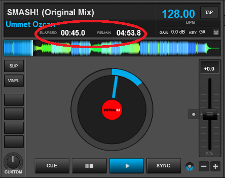
i want it to look like that... (its a pic from the 4 decks skin)


i want it to look like that... (its a pic from the 4 decks skin)

Posté Sun 13 Jul 14 @ 12:05 am
apparently you have entered some code from the 4 decks skin to the 2 decks one.
Probably 4 elements for each deck (2 for the REMAIN, ELAPSED texts and 2 for the times.
Each one of them should have ..
<pos x="number" ../>
you need to add -number2 to all of them. so if you want to move them 100 pixels to the left, the text must look like
<pos x="number-100" ../>
Probably 4 elements for each deck (2 for the REMAIN, ELAPSED texts and 2 for the times.
Each one of them should have ..
<pos x="number" ../>
you need to add -number2 to all of them. so if you want to move them 100 pixels to the left, the text must look like
<pos x="number-100" ../>
Posté Sun 13 Jul 14 @ 3:50 am
Yes - you will notice that some coordinates have one (whole) number assigned, while others have a number plus or minus another (e.g. 915-50 or 915+50) and
some will only have the shifted number (e.g. +50 or -78 etc).
The whole numbers (no + or -) are absolute pixel locations, and the ones with + or - in front are relative locations.
Absolute is like saying your house is 22 Acacia Avenue, Pixeltown, Iceland.
Relative is saying your house is five doors down from there.
Posté Sun 13 Jul 14 @ 6:25 am
Thank you very much Guys now its perfect !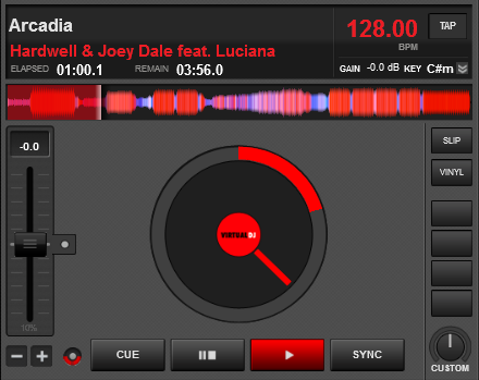

Posté Sun 13 Jul 14 @ 11:40 am
Nearly perfect, that gain number looks a touch too high on the y axis. :-p
Posté Sun 13 Jul 14 @ 2:48 pm
So it does!
Another thing (which I reported yonks ago) is that the "dB" text can get cut off when the gain figures are different (the "dB" gets pushed right and disappears under the "key" text zone). The gain text and digits could do with coming left a bit to avoid the problem.
Another thing (which I reported yonks ago) is that the "dB" text can get cut off when the gain figures are different (the "dB" gets pushed right and disappears under the "key" text zone). The gain text and digits could do with coming left a bit to avoid the problem.
Posté Sun 13 Jul 14 @ 3:51 pm
locodog wrote :
Nearly perfect, that gain number looks a touch too high on the y axis. :-p
like groovindj said, if the "db" will be bigger it will be the same high but then in every change the "dB" gets pushed right and disappears under the "key" text zone,
as you can see in the pic this is the best size that does not disappears under the "key" text zone even that there is a Minus sign Before the numbers...
Posté Sun 13 Jul 14 @ 5:31 pm
I was messing around with it earlier, and moved the GAIN and dB figure left as much as I could, but still couldn't prevent it from being cut off entirely.
IMO it's not that important to have the gain figure displayed anyway. I use my eyes and ears!
IMO it's not that important to have the gain figure displayed anyway. I use my eyes and ears!
Posté Sun 13 Jul 14 @ 6:07 pm
A Small fix... (-;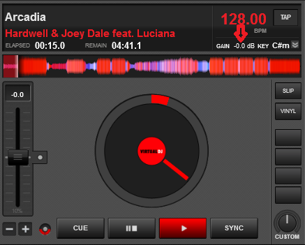

Posté Sun 13 Jul 14 @ 6:27 pm
A bigger fix would be to move the large BPM figure up (plenty of room above it), remove the text "BPM" (we know what the numbers mean!) and have the gain text in the area below the BPM & above the key. The key could be moved to be more central, with the gain above it.
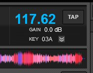
(mockup)

(mockup)
Posté Sun 13 Jul 14 @ 6:32 pm
you can change that all day, but i think this is Good enough for me, i just wanted a slight improvement of the original skin...
Posté Sun 13 Jul 14 @ 6:46 pm
Remember to keep a backup of your modified skin in case you ever reinstall VDJ etc.
Posté Sun 13 Jul 14 @ 6:51 pm
BTW if there is something that need a fix its...

Posté Sun 13 Jul 14 @ 7:04 pm
I fixed it ! 
I think I have too much spare time...

I think I have too much spare time...
Posté Sun 13 Jul 14 @ 7:36 pm
*edit oops I didn't look at your pic properly, ignore me*
Check out Soft Gold skin, that removes cover art and the track time zone for a beautiful clear full width non-faded rhythm wave.
Study that xml and it should become clear what you have to do.
Whilst I understand that the default skin has to be noob friendly but Atomix not allowing nuisance correction skins you are making many instances of duplication of effort.
Allow these minor edits just exclude payment to the editor.
Posté Sun 13 Jul 14 @ 7:39 pm
@DJ SWID
You may have to much time on your hands - but it's beneficial to the VDJ family, So +1 for making your skin available for download
You may have to much time on your hands - but it's beneficial to the VDJ family, So +1 for making your skin available for download
Posté Mon 14 Jul 14 @ 12:40 am
All of those mods already are in my skin for example (except long length tracks times, but I corrected it this morning after reading your thread), did you give it a try ?
http://www.virtualdj.com/addons/16811/VirtualDJ_8_but_by_FRUiT.html
http://www.virtualdj.com/addons/16811/VirtualDJ_8_but_by_FRUiT.html
Posté Mon 14 Jul 14 @ 4:12 am
Fruit wrote :
All of those mods already are in my skin for example, did you give it a try ?
http://www.virtualdj.com/addons/16811/VirtualDJ_8_but_by_FRUiT.html
http://www.virtualdj.com/addons/16811/VirtualDJ_8_but_by_FRUiT.html
I have now and WOW! it's proper good looking too, cheers
Posté Mon 14 Jul 14 @ 4:18 am
Thanks ^^
Posté Mon 14 Jul 14 @ 4:26 am
Fruit wrote :
Thanks ^^
I've now been using your skin for the past 4hrs, you've got some very interesting tweaks which aren't hidden but when I saw them and had a play I was happily surprised. Love the option of having the cover in the wheels as they turn - thats a sweet touch and a nod to vinyl (I have mine at 2 RPM - takes a full minute to do a revolution). Thanks again
Posté Mon 14 Jul 14 @ 11:11 am


