royvanmeel wrote :
Wish:
I would like to choose:
Decks -> jogs -> style -> auto cover / custom cover
instead of "auto cover / analog"
Now I see sometimes a nice cover and another deck just a moving line
I believe the ones that use graphic covers, also want a custom logo cover when a cover is not available.
I would like to choose:
Decks -> jogs -> style -> auto cover / custom cover
instead of "auto cover / analog"
Now I see sometimes a nice cover and another deck just a moving line
I believe the ones that use graphic covers, also want a custom logo cover when a cover is not available.
"Auto Cover/Digital" and "Auto Cover/Custom" will be added on next build.
PS: In order to use the custom cover you need to edit the png file of the skin.
I will provide instructions on how to do that soon on a separate post
Posté Sat 02 May 15 @ 10:52 am
DJSoulman wrote :
A major feedback problem from my point of view;
there is no bullet indicator to show smart play, smart cue, smart loop, master tempo, pitch range and buttons behaviour that's on many other skins.
I use the smart play indicator throughout a gig as I switch it on and off depending whether I'm beat mixing the next tune or not. I have re-programmed some buttons on my MC6000 to be able to do this during a gig. I have also programmed buttons to reset the pitch after beat mixing, it would be useful to have some sort of indication (flashing) when resetting the pitch. I have a button combination for pitch lock too.
Without this feedback I won't be able to use the skin.
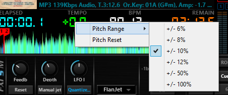
"Smart" options are not present, that's true. However Master Tempo, Pitch Reset and Pitch Range are there... (Master tempo is the button on the lower right of the jogs, you can reset the pitch by clicking the "0" text on the pitch sliders, and the pitch rage is visible on top and bottom area of the pitch slider. Finally you can change the pitch range by clicking the pitch amount of each deck (the green text on each deck that shows the current pitch)
Posté Sat 02 May 15 @ 11:00 am
royvanmeel wrote :
On the sz: I can't clear saved roll loops with shift and pad.
On the controller itself ? Or on skin ?
Generally, the skin imitates "shifted" operations by rightclicking on an element.
If it's on the controller that's not working and you use the default mapper perhaps there's a bug we need to explore.
Posté Sat 02 May 15 @ 11:03 am
Charlie Wilson wrote :
Great work Phantom,
I noticed two things only on my macbook pro 15 retina, part of the time missing and part of the cpu text missing, see images below.


I noticed two things only on my macbook pro 15 retina, part of the time missing and part of the cpu text missing, see images below.


I allready explained why is that.
I will fix on next build.
Thanks!
Posté Sat 02 May 15 @ 11:04 am
how do you activate the full screen browser? cant seem to find the button or option to turn it on.... i know its probably in front of my face but i have looked and looked can't seem to locate it :-(
Posté Sat 02 May 15 @ 11:05 am
PhantomDeejay wrote :
making the skin "brighter" means that all graphics need to be redesigned from scratch
I wouldn't say that. I think that maybe a <visual> colour block could be added to the background of the "decks and mixer" area. This could be a lighter colour, or even a selection of colours selected from a menu in the same way as skins by FRUiT and djdad.
Another way would be to simply tweak the colours for those buttons in the bitmap.
Posté Sat 02 May 15 @ 11:11 am
wickedmix wrote :
how do you activate the full screen browser? cant seem to find the button or option to turn it on.... i know its probably in front of my face but i have looked and looked can't seem to locate it :-(
Currently you can do it with 2 ways:
1) On skin options turn on Browser Toolbox, click on the button on center.
or
2) Map a button on your keyboard/controller with the following command: toggle '$BR_MAX'
Posté Sat 02 May 15 @ 11:11 am
groovindj wrote :
I wouldn't say that. I think that maybe a <visual> colour block could be added to the background of the "decks and mixer" area. This could be a lighter colour, or even a selection of colours selected from a menu in the same way as skins by FRUiT and djdad.
Another way would be to simply tweak the colours for those buttons in the bitmap.
PhantomDeejay wrote :
making the skin "brighter" means that all graphics need to be redesigned from scratch
I wouldn't say that. I think that maybe a <visual> colour block could be added to the background of the "decks and mixer" area. This could be a lighter colour, or even a selection of colours selected from a menu in the same way as skins by FRUiT and djdad.
Another way would be to simply tweak the colours for those buttons in the bitmap.
Groovin, I know how to handle graphics very well.
Adding a "white overlay" over the skins backround for instance will make the skin look brighter, but it will also reduce the contrast. The more white you add, the more contrast you loose and the graphics look washed out.
VirtualDj skin engine supports only "simple overlay" mode for graphics. You can't overlay a color using "substract" for instance. And I wouldn't expect it to support it to be true.
Also all buttons use shadings and other FX that makes it impracticall to just overlay them a white to make brighter.
I will have to change their color dirrectly, re-render and then add-again on the png on the exact same location with the old one.
It's not impossible. It just requires a generous amount of time that (at this point) I would prefer to use in order to provide more functions/options.
Posté Sat 02 May 15 @ 11:18 am
I'm not suggesting that you don't know what you're doing!
I'm just saying (to Soulman) that there are various ways of changing it that don't require much work. Another option is to replace the whole 1920x1080 "brushed look" background graphic in the PNG with another image - or a <visual> colour block.
On page 2 you said "I have paid great attention for the end user to be able to easily modify the background"...
Example (done in under 5 mins):
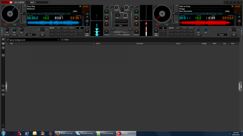
I just added a visual colour block 1920x1080 hex #363636
I'm just saying (to Soulman) that there are various ways of changing it that don't require much work. Another option is to replace the whole 1920x1080 "brushed look" background graphic in the PNG with another image - or a <visual> colour block.
On page 2 you said "I have paid great attention for the end user to be able to easily modify the background"...
Example (done in under 5 mins):

I just added a visual colour block 1920x1080 hex #363636
Posté Sat 02 May 15 @ 11:22 am
PhantomDeejay wrote :
Currently you can do it with 2 ways:
1) On skin options turn on Browser Toolbox, click on the button on center.
or
2) Map a button on your keyboard/controller with the following command: toggle '$BR_MAX'
wickedmix wrote :
how do you activate the full screen browser? cant seem to find the button or option to turn it on.... i know its probably in front of my face but i have looked and looked can't seem to locate it :-(
Currently you can do it with 2 ways:
1) On skin options turn on Browser Toolbox, click on the button on center.
or
2) Map a button on your keyboard/controller with the following command: toggle '$BR_MAX'
not sure what you mean with 1 and 2 doesn't work mapping a keyboard key to toggle '$BR_MAX'
thanks
Posté Sat 02 May 15 @ 11:29 am
1) Click on skin option menu button (right next to the clock) and select Browser->Show Custom Buttons Toolbox
Now you should see a line with custom buttons under the decks in top of browser.
The button in the middle should say "Max Browser"
Click it...
PS: On this skin the maximized browser still shows 2 mini decks on top...
The idea behind this is that if you are an "old school die hard" dj you can keep maximized view open all the time and dj from there...
So, on this view only very basic info is shown on screen (track info and progress waveforms)
PS2: I just tried toggle '$BR_MAX' and works fine...
Posté Sat 02 May 15 @ 11:58 am
sorry i am not trying to be a pain in the butt it's a really nice skin.
as u can see from the shot below the option isn't on the menu you have described
maybe the version i have is somehow not the current one
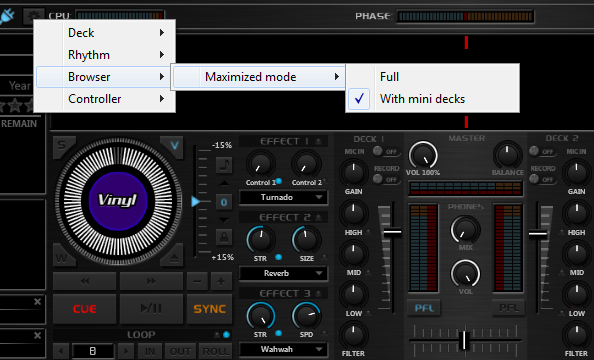
sorry i just realized i download silversleek original and not #2 please ignore me
as u can see from the shot below the option isn't on the menu you have described
maybe the version i have is somehow not the current one

sorry i just realized i download silversleek original and not #2 please ignore me
Posté Sat 02 May 15 @ 12:06 pm
LOL. It's okay!!! :)
I hope you like both then!
I hope you like both then!
Posté Sat 02 May 15 @ 12:23 pm
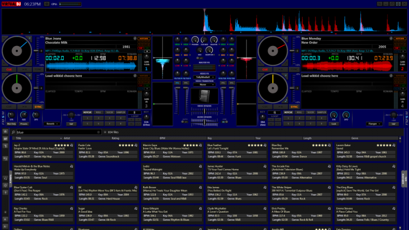
Dark blue version:

Posté Sat 02 May 15 @ 12:25 pm
groovindj wrote :
I'm not suggesting that you don't know what you're doing!
I'm just saying (to Soulman) that there are various ways of changing it that don't require much work. Another option is to replace the whole 1920x1080 "brushed look" background graphic in the PNG with another image - or a <visual> colour block.
On page 2 you said "I have paid great attention for the end user to be able to easily modify the background"...
Example (done in under 5 mins):

I just added a visual colour block 1920x1080 hex #363636
I'm just saying (to Soulman) that there are various ways of changing it that don't require much work. Another option is to replace the whole 1920x1080 "brushed look" background graphic in the PNG with another image - or a <visual> colour block.
On page 2 you said "I have paid great attention for the end user to be able to easily modify the background"...
Example (done in under 5 mins):

I just added a visual colour block 1920x1080 hex #363636
Groovin, there's a very good reason the skin was created the way it is... And I know that adding a visual (without visibility) works
If you open the png file you'll see that you can change the brushed aluminum backround with ANY image you want and the skin will work correctly, up to the last detail.
The initial idea behind this skin was that every user should be able to get it as close to it's own needs as possible.
Also it's designed that way so that a DAYLIGHT version will be able to be created without too much hassle. (Yes I plan to release a DAYLIGHT version later down the road)
Posté Sat 02 May 15 @ 12:29 pm
PhantomDeejay wrote :
The initial idea behind this skin was that every user should be able to get it as close to it's own needs as possible.
The initial idea behind this skin was that every user should be able to get it as close to it's own needs as possible.
That's good - so why did you tell DJSoulman "all graphics need to be redesigned from scratch"? I think that changing the background colour would help him.
Posté Sat 02 May 15 @ 12:36 pm
He asked about the buttons, not the BG. Also I don't plan to change the default BG of the skin right now.
Finally, since you read my reply to him, I want to make sure it's not something wrong with his display/drivers/settings.
If it's just too dark for him (and not anther issue) then yes I can guide the guy on how to change BG :)
Finally, since you read my reply to him, I want to make sure it's not something wrong with his display/drivers/settings.
If it's just too dark for him (and not anther issue) then yes I can guide the guy on how to change BG :)
Posté Sat 02 May 15 @ 12:43 pm
I will say this on my Mac the skin does seem darker then on my PC but it's not a problem for me 👌
Posté Sat 02 May 15 @ 12:53 pm
For the darkness of the skin I have solved it for now.
I have been using f.lux for about a year on both PC & Mac. All other skins are fine but this one is a little too dark. I can get around this by disabling f.lux temporarily.
I'm currently using djdads SWAP 4DECKS skin which is fine with f.lux.
I know that some of the things I mentioned are available on the skin, I only mentioned them as they are part of the bullet found on the default skin. Personally I'm more concerned with the indicator to show that smart play is engaged or not, I use this at every gig.
Posté Sat 02 May 15 @ 1:45 pm
I will add smart indicators.
I was thinking to get rid of cue & play glyphs on the decks screen (under hotcues) to add smart indicators for some time now.
When I initially designed the screens I had some other things in mind...
Otherwise I may even add a "bullet" somewhere...
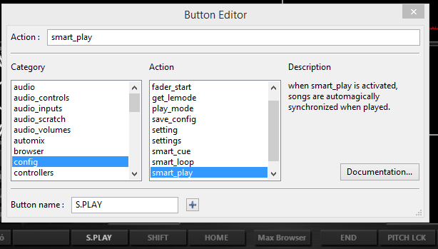
For the time you can make the custom buttons toolbox visible and configure 2 custom buttons (one on each side) as "smart_play"

Posté Sat 02 May 15 @ 1:52 pm


