hello everybody.
i would like your opinion on which logo you like and why. the more detail the better.
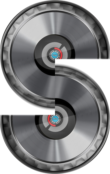
so, basically i took dic/record images, put them together, crop out 1/4 of it, duplicate, and flip. to make an s shape.
my dj name is DJ Shahar, so i'm looking at using the special S as my new logo.
here are my 3 concepts images.


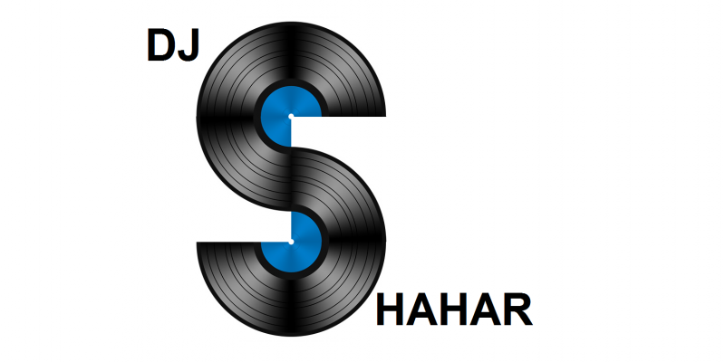
this is how the s will be included with my full dj name
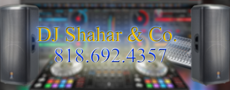
here is my current dj banner.
i would like your opinion on which logo you like and why. the more detail the better.
so, basically i took dic/record images, put them together, crop out 1/4 of it, duplicate, and flip. to make an s shape.
my dj name is DJ Shahar, so i'm looking at using the special S as my new logo.
here are my 3 concepts images.


this is how the s will be included with my full dj name

here is my current dj banner.

Posté Wed 05 Jul 17 @ 10:01 pm
No offense, but I think you should contact someone with some experience in logo design.
Your approaches are way too detailed. Concetrate on a clean simple layout. And maybe forget the "S" idea.
Why not just DJ Shahar in a nice font?
Your approaches are way too detailed. Concetrate on a clean simple layout. And maybe forget the "S" idea.
Why not just DJ Shahar in a nice font?
Posté Thu 06 Jul 17 @ 8:05 am
The Pioneer Jog ones don't look good or professional because their synthesis is wrong.
The vinyl ones look better, but still you should move the parts a few pixels in order to get a "perfect" shape
The vinyl ones look better, but still you should move the parts a few pixels in order to get a "perfect" shape
Posté Thu 06 Jul 17 @ 10:30 am
take a look at this:
https://community.mixedinkey.com/Topics/5375/yakovs-advice-how-to-design-the-perfect-dj-logo
http://www.thelogofactory.com/7-golden-rules-of-logos/
Imo your logo won't fit for banners or flyer. You should try to fit in the golden ratio rule.
https://community.mixedinkey.com/Topics/5375/yakovs-advice-how-to-design-the-perfect-dj-logo
http://www.thelogofactory.com/7-golden-rules-of-logos/
Imo your logo won't fit for banners or flyer. You should try to fit in the golden ratio rule.
Posté Thu 06 Jul 17 @ 11:29 am
First of all good Thing you're thinking of a Logo...a Logo always makes you unique.
Then, you might get Troubles with Pioneer using their Jogs.
Then think about where this Logo is gonna be used. Mostly it will be on Websites, Flyers or Poster, those mostly are full colored so try to think about visibility of your Name, my Logo is Black & White exactly for that reason and if you look at the big Names in da Business, their Logos mostly are B&W.

If you take your current DJ Banner, it might look OK on the Computer Monitor but your DJ Name in Yellow on a non-dark Background...How does it look like printed on a Banner, in a shaded Party room???
Another Advantage of B&W it can always be inverted depending on the Color of the Background you place it.
And non negligeable Advantage, all your Business Card will cost way less to be printed B&W than in Color.
Then, you might get Troubles with Pioneer using their Jogs.
Then think about where this Logo is gonna be used. Mostly it will be on Websites, Flyers or Poster, those mostly are full colored so try to think about visibility of your Name, my Logo is Black & White exactly for that reason and if you look at the big Names in da Business, their Logos mostly are B&W.

If you take your current DJ Banner, it might look OK on the Computer Monitor but your DJ Name in Yellow on a non-dark Background...How does it look like printed on a Banner, in a shaded Party room???
Another Advantage of B&W it can always be inverted depending on the Color of the Background you place it.
And non negligeable Advantage, all your Business Card will cost way less to be printed B&W than in Color.
Posté Thu 06 Jul 17 @ 11:50 am


