I'm getting anxious when will we see some of these new skins? :D
Posté Thu 17 Jul 08 @ 2:50 pm
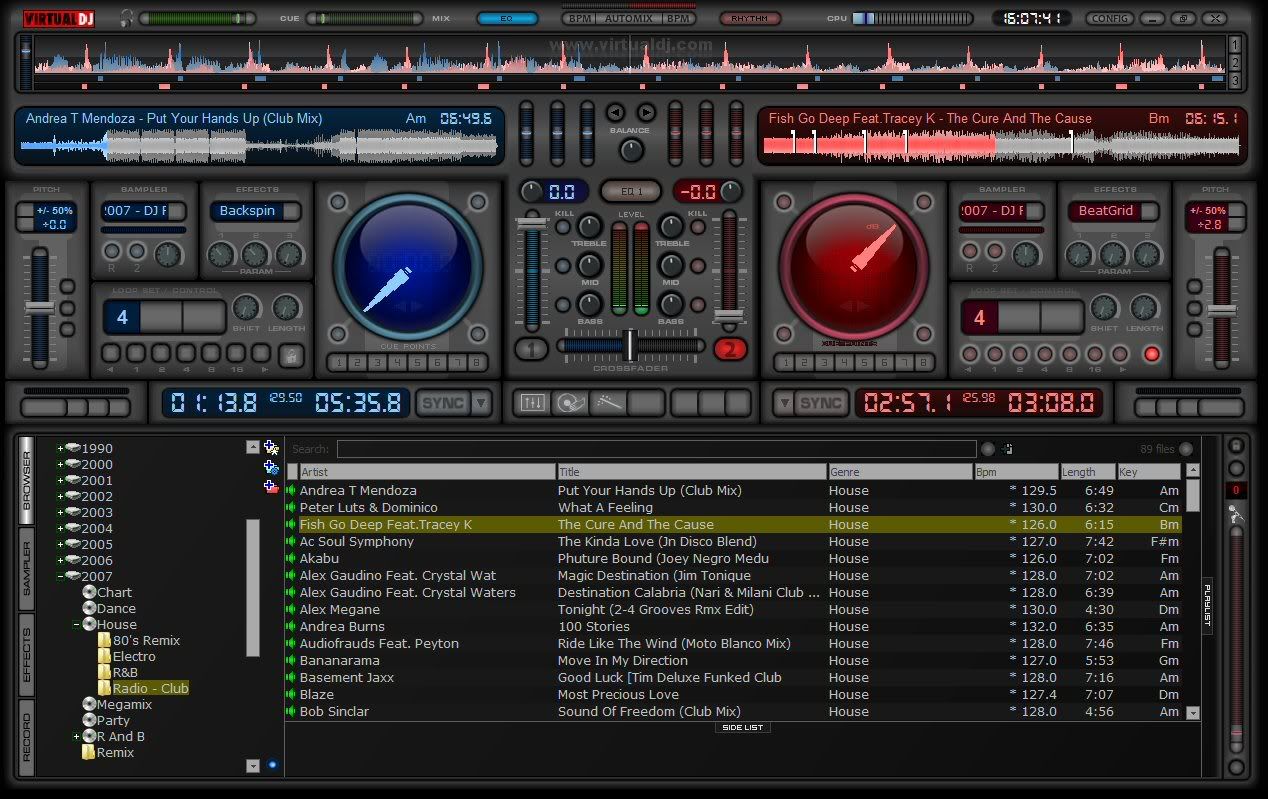
Hello my friends, I am going to release MixLab 3.1. It is not 100% finished, and sadly it never will be. I have moved on to MixLab V4. MixLab 3.1 is totally operational with VDJ/CUE 5.1. Key and Camalot information is there for example. Remember on many of my skins there are hidden panels so always try clicking on an area too see if it has hidden features. I am still thinking about public consumption of MixLab4 and will keep everyone updated. On the left Deck/Player there are tabs that will be utilized in MixLabv4, so think of your selves all as beta testers. Cheers for all your support, Peace and Love…
Mix Lab V3.1 Widescreen 1280 x 800

Mix Lab V3.1 Widescreen 1280 x 800 Download Now
DJ FORMAT
SkinMaster
Mix Lab V3.1 Widescreen 1280 x 800

Mix Lab V3.1 Widescreen 1280 x 800 Download Now
DJ FORMAT
SkinMaster
Posté Thu 17 Jul 08 @ 4:54 pm
Good..Hidden pannels:-)
I hope I'll be the first to find all of them.
As usual you are the best Format.
I'm not able to explain myself how you made it and above all how long you worked...
You have a lot of patience.
It's incredible!!
I hope I'll be the first to find all of them.
As usual you are the best Format.
I'm not able to explain myself how you made it and above all how long you worked...
You have a lot of patience.
It's incredible!!
Posté Thu 17 Jul 08 @ 5:00 pm
Mix Lab 4.0
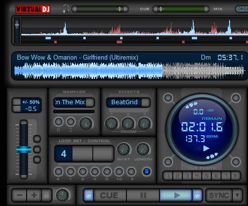

Posté Tue 22 Jul 08 @ 7:32 pm
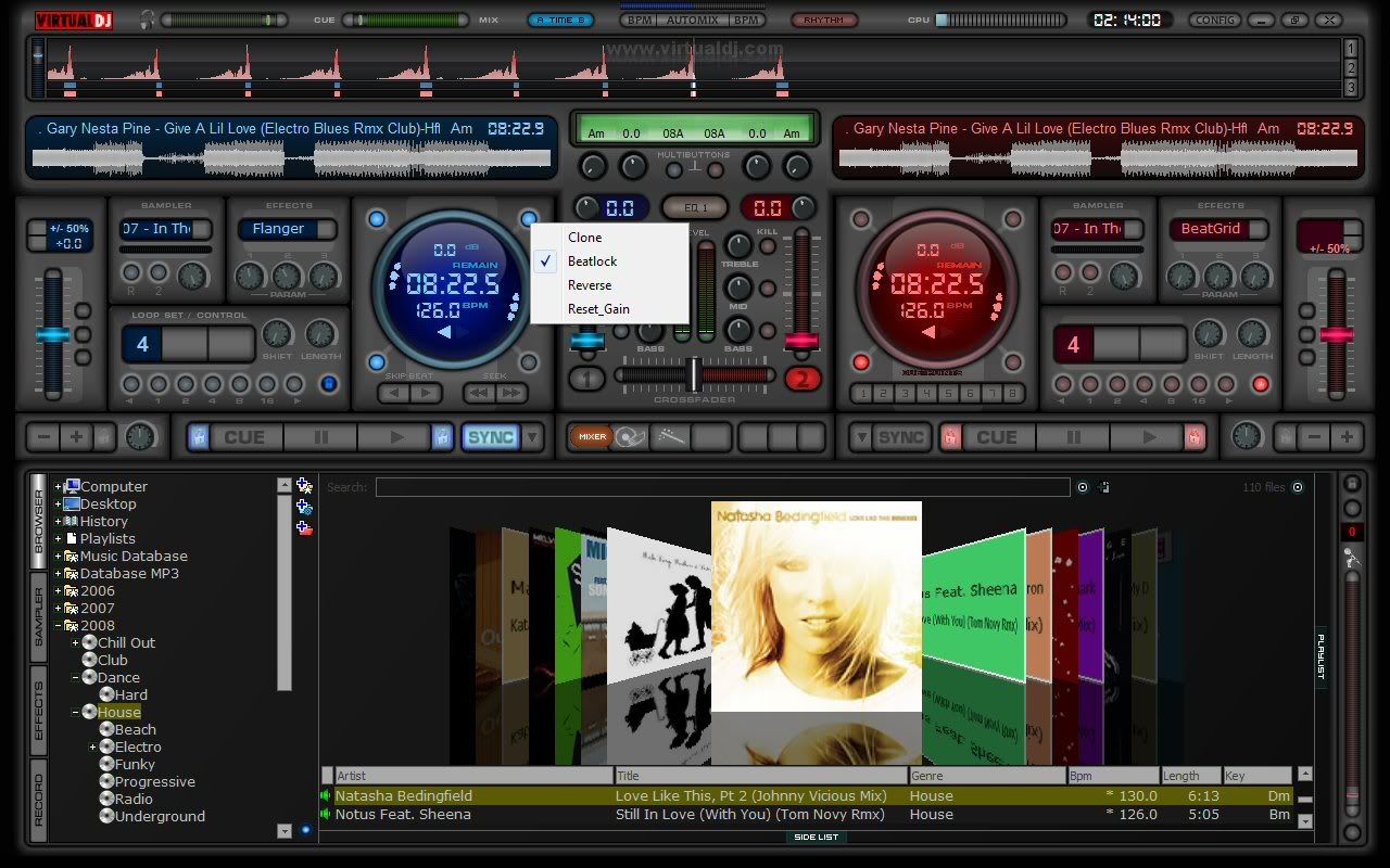
Posté Tue 22 Jul 08 @ 8:30 pm
TC Pannel New in Mix Lab 4.0
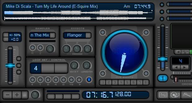

Posté Wed 23 Jul 08 @ 8:58 am
Looks great Format!!
Posté Wed 23 Jul 08 @ 1:04 pm
The icons on the buttons to change pannel look great Matthew.
I would really like to have the Skin Editor finished so you could work more quickly.
I hope to have it finished or at least useable for the 5th of August.
I would really like to have the Skin Editor finished so you could work more quickly.
I hope to have it finished or at least useable for the 5th of August.
Posté Wed 23 Jul 08 @ 1:18 pm
Update on TC Pannel
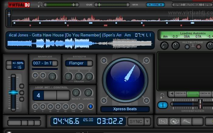

Posté Wed 23 Jul 08 @ 7:32 pm
Posté Fri 25 Jul 08 @ 10:11 am
Yes it can go down to 1024x768. The resize must be done with the Skin Resizer Tool you will find here: http://www.virtualdj.com/addons/tools.html
To resize the skin, you will need to unzip it, then open the XML file in the tool, and select 1024x768 as output size.
The resize won't be bad, but as this isn't a proportional resize, it won't look as good as original one.
If you donate for the tool, you will be able to use alot more features.
This is the way to go to have a perfect resize with the licensed version options:
Step 1
Open the XML file.
Write 1024 x 640 as output size.
Click on "..." output button to select the ouptut file. Best is to leave the default output filename.
Activate "Resize XML" and "Resize Picture" if not activated
Tick (activate) "Browser options" and then click on "Browser" button.
In the new window, tick again "browser options" (it's above "text color").
[Optional]: Change text size to 13.
Click on "Apply".
Now click on "Do the job".
Close the window that has just popped up.
Step 2
Click on "Licensed" in the menu, then on "Reload last created skin".
Now write 1024 x 768 as output size.
Erase the previous filename. Click on "..." output button to select the output filename.
De-activate "Resize XML" and "Resize Picture". De-activate "Browser Options"
Tick "Resize Browser".
Click on "Do the job".
Zip the .bmp and .xml files that were created at step 2.
Test the skin.
If everything is ok, then delete the first two .bmp and .xml files that were created at step 1.
Now the skin should look much better.
----
You might see that the browser background's color isn't plain. If you want it to be plain (black or another color), with paint or any other graphic program, create a 1x1 picture the color you want and save it as a BMP file.
At step 1, in the Browser options window, click on "...", open the 1x1 picture, then click on "Adapt picture".
The resized skin will now have a browser with a single color background.
Posté Tue 29 Jul 08 @ 7:53 pm
Matt -
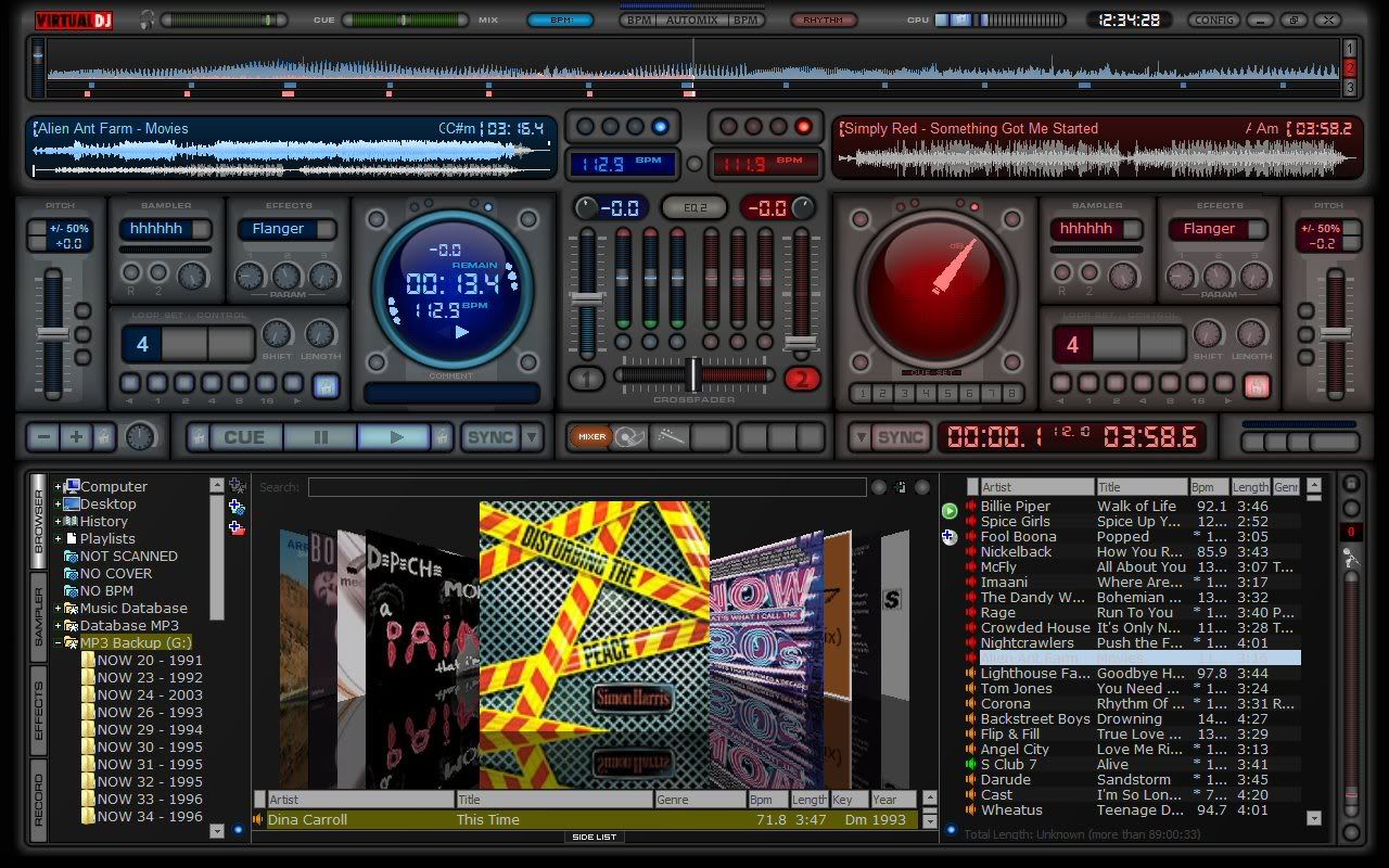
Loving the skin But have a few suggestions... can you move the KEY info down below the BPM in that small time/bpm cluster. Also if you are showing both elapse and remaining in that zone then remove the time from up by the waveform.
Now there is a madness behind my suggestion, because one thing that has been missing from most skins is the playing file's Comment info. By moving/removing those items from up by the waveform you now could have some space for the Comment field next to the Artist-Title info. Also, if you do add the Comment field, make sure you add the right-click edit comment action to the field -- allows for quick edits to the comments.
Just a suggestion Matt... GREAT WORK !!!
Chris
Posté Sun 03 Aug 08 @ 12:25 pm
@Chris:
The time from up by the waveform is the total time of the track, not elapsed/remaining (if you didn't remark that).
The comment is already visible, right under the spinning needle. It is panneled, so the user can have some other buttons at that place if the comment isn't necessary.
Rightclick edit for comment is a good idea ;)
Posté Sun 03 Aug 08 @ 6:56 pm
JeremK wrote :
@Chris:
The time from up by the waveform is the total time of the track, not elapsed/remaining (if you didn't remark that).
The comment is already visible, right under the spinning needle. It is panneled, so the user can have some other buttons at that place if the comment isn't necessary.
Rightclick edit for comment is a good idea ;)
The time from up by the waveform is the total time of the track, not elapsed/remaining (if you didn't remark that).
The comment is already visible, right under the spinning needle. It is panneled, so the user can have some other buttons at that place if the comment isn't necessary.
Rightclick edit for comment is a good idea ;)
Just suggestions - but the comments behind a pannel ?? Should be immediately available like the Artist - Title. As for the total time of a song ? useless information if you ask me ... that should be on a click action with the elapsed/remaining times.
Again. Just suggestions and the comment info was really me intention.
Posté Sun 03 Aug 08 @ 11:56 pm
You are right to make suggestions. User and future user suggestions is what makes the skin the best skin ever.
I'm really happy today, i've solved some problem i had in the skin creator program i'm working on. DJ Format will be able to use it very soon :)
I'm really happy today, i've solved some problem i had in the skin creator program i'm working on. DJ Format will be able to use it very soon :)
Posté Mon 04 Aug 08 @ 8:45 am
Is this project dead ? No news since looon time. MAybe you can provide a beta version or something ?
Thanks for the job
Thanks for the job
Posté Fri 26 Sep 08 @ 8:07 am
Very nice man....
Posté Wed 01 Oct 08 @ 9:51 am
FORMAT has had some problem with his connection to the internet. Please be patient, I am sure once he is back up to full steam he will post some information. T
Posté Wed 01 Oct 08 @ 2:31 pm
Thanks for the update, Tear...I monitor this forum and haven't heard much in quite some time. I was wondering what happened...Maybe this will quiet us down for awhile, LOL ;)
Posté Thu 02 Oct 08 @ 5:23 pm
OK i am back working on MIX LAB 4.0 Coming Soon
My PayPal is
djformat2004@yahoo.co.uk
I have not set up my subscription service yet coming soon but if you don't want to be a subscription service member Mix Lab 4.0 update will be one time payment of $25
My PayPal is
djformat2004@yahoo.co.uk
I have not set up my subscription service yet coming soon but if you don't want to be a subscription service member Mix Lab 4.0 update will be one time payment of $25

Posté Mon 24 Nov 08 @ 2:51 am


