Here is an idea ive been playing around with for a while now for my fijitsu u1010 vertically
its a 600x 1024 skin layout idea.
Unfortunately ill have to postpone it till after this summer season as ill be flat out for 5 months.
Any one else wanting to land a hand just send me a pm and ill upload the psd file.
Id love a 600x1024 made but id settle for the standard layout sizes too.
I call it virtual tribalism
Was looking for color blending for the sliders as they go up and stronger highlights for the knobs as they get turned up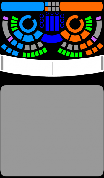
comments also welcome
its a 600x 1024 skin layout idea.
Unfortunately ill have to postpone it till after this summer season as ill be flat out for 5 months.
Any one else wanting to land a hand just send me a pm and ill upload the psd file.
Id love a 600x1024 made but id settle for the standard layout sizes too.
I call it virtual tribalism
Was looking for color blending for the sliders as they go up and stronger highlights for the knobs as they get turned up

comments also welcome
Posté Wed 13 May 09 @ 10:02 am
good idea
Posté Wed 13 May 09 @ 11:02 am
As it happens, ive just got my hands on a touchscreen netbook.
if you could pm me a link to your design, prefrably in BMP format, i'll give it a go to build your skin :)
if you could pm me a link to your design, prefrably in BMP format, i'll give it a go to build your skin :)
Posté Wed 13 May 09 @ 11:23 am
Just tell me which button shoud do what and i'll make it.
Posté Wed 13 May 09 @ 12:11 pm
There will be one problem with the skin, the rhythm area needs to be straight.
Posté Wed 13 May 09 @ 12:36 pm
JeremK wrote :
There will be one problem with the skin, the rhythm area needs to be straight.
ive noticed that. it'll have to be straightened out.
Posté Wed 13 May 09 @ 1:14 pm
UPDATE...
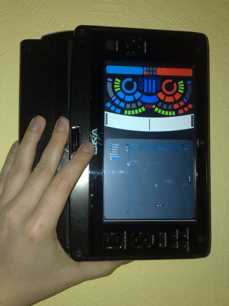
i'll continue tomorrow on this, let me know which button dows what, and can you straiten out the rhythm bar, ta.

i'll continue tomorrow on this, let me know which button dows what, and can you straiten out the rhythm bar, ta.
Posté Wed 13 May 09 @ 1:17 pm
quick reply
thx for the interest, straitening and uploading bmp
will also make a guide of what button is what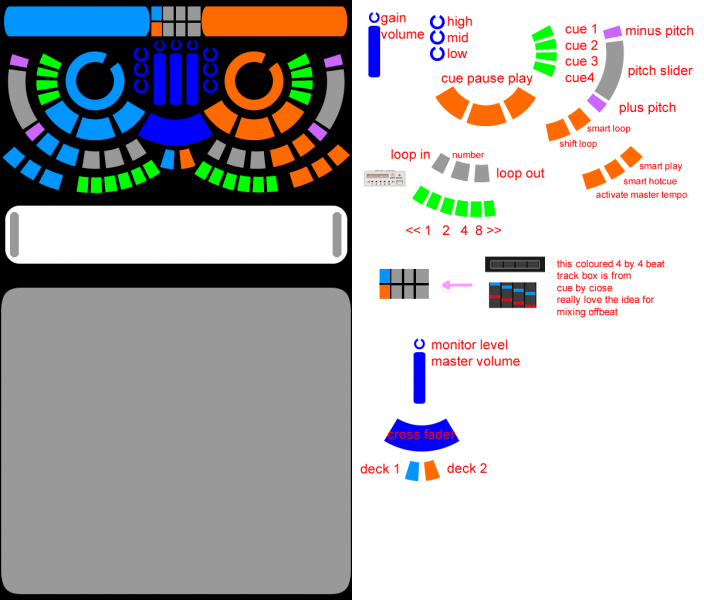
so far
also added 2 extra keys for selecting deck
will work on chunky slider graphic
thx for the interest, straitening and uploading bmp
will also make a guide of what button is what

so far
also added 2 extra keys for selecting deck
will work on chunky slider graphic
Posté Wed 13 May 09 @ 7:16 pm
Some colors for the volume sliders, need to re look at the 2 new added deck buttons they look weird there
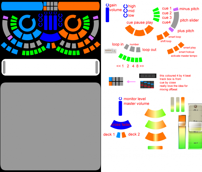
Posté Wed 13 May 09 @ 8:43 pm
Ive figured how to make most of the buttons, but i might need some help with the circular song position...
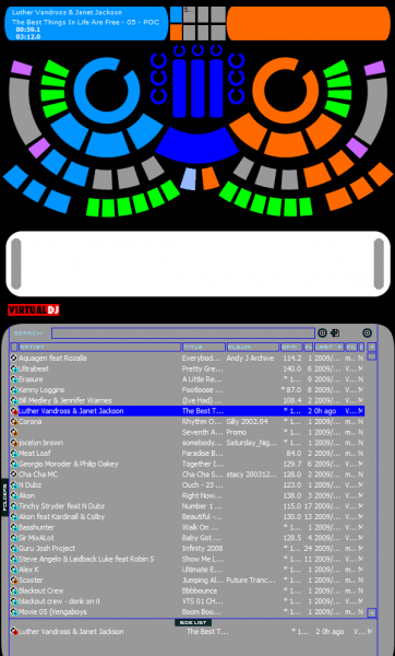
if anyone can help, let me know...

if anyone can help, let me know...
Posté Tue 19 May 09 @ 11:22 am
<songpos chan="1" orientation="circle" waveform="no" >
But it needs to be a complete circle.
But it needs to be a complete circle.
Posté Tue 19 May 09 @ 7:05 pm
JeremK wrote :
<songpos chan="1" orientation="circle" waveform="no" >
But it needs to be a complete circle.
But it needs to be a complete circle.
Complete circle? hmm
ive not tryed the waveform="no", but i got it to find my clipmask, and i coloured my circular area properly. it just dosent follow the song as it plays :o
i'll try the above...
Posté Tue 19 May 09 @ 7:16 pm
marksmolinski wrote :
Complete circle? hmm
ive not tryed the waveform="no", but i got it to find my clipmask, and i coloured my circular area properly. it just dosent follow the song as it plays :o
i'll try the above...
JeremK wrote :
<songpos chan="1" orientation="circle" waveform="no" >
But it needs to be a complete circle.
But it needs to be a complete circle.
Complete circle? hmm
ive not tryed the waveform="no", but i got it to find my clipmask, and i coloured my circular area properly. it just dosent follow the song as it plays :o
i'll try the above...
ok now i get further, thanks.
Next issue...
<circle x="162" y="139" r="0" anglemin="0" anglemax="360"/>
x= and y= must be the CENTER of the circle, which i was stuck on.
but what does the r="0" mean?
Does it mean ROTATION?
Posté Tue 19 May 09 @ 7:32 pm
I have the circle starting from 50 degrees, but it ends at the top, with some way still to go.
does it have to end at "12 oClock??"
does it have to end at "12 oClock??"
Posté Tue 19 May 09 @ 7:37 pm
X-Static wrote :
Here is an idea ive been playing around with for a while now for my fijitsu u1010 vertically
Your screen is just 5.6 inches diagonal ???
youre gonna need a fairly large font size for the browser if you want to 'touch' with your finger?
Have you tryed to import the screen grab from above? how does the text look?
Im gonna make the text bigger for the artist and song title later.
also..
X-Static wrote :
I call it virtual tribalism
ive just spotted this at he top of the topic, i'll call it this when its ready.
Posté Tue 19 May 09 @ 7:57 pm
marksmolinski wrote :
I have the circle starting from 50 degrees, but it ends at the top, with some way still to go.
does it have to end at "12 oClock??"
does it have to end at "12 oClock??"
gonna need to rotate the notch in the graphic round to start at the top.
then i could put a button in the gap to select the Deck...
BTW, r=RADIUS. the distance in pixcels from the center, so that VDJ knows where to put the CUE markers.
Posté Tue 19 May 09 @ 8:47 pm
not that i use touchscreens at the moment - i am going to be interested in seeing this one.
Posté Wed 20 May 09 @ 6:01 am
well this is designed to work on a wide aspect screen rotated thru 90 degrees.
the graphics have been designed to work on a 5.6inch UMPC screen...
im testing it on my 7inch netbook, works great there, and looks better on my 32in LCD :)
but once im finnished, im going to do a remixed verion for bigger monitors.
the graphics have been designed to work on a 5.6inch UMPC screen...
im testing it on my 7inch netbook, works great there, and looks better on my 32in LCD :)
but once im finnished, im going to do a remixed verion for bigger monitors.
Posté Wed 20 May 09 @ 7:22 am
great to see the skin comming along nicely.
as for the font the bigger the better...
as for the font the bigger the better...
Posté Sun 24 May 09 @ 2:31 pm


