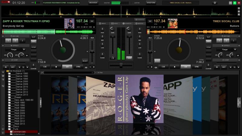
A modified version of the original skin with softer colors, expanded waveforms and the possibility to display the Browser on the entire page. However, it is for 2 decks.
....
Voici une version modifiée de la skin d’origine avec des couleurs plus douce, des spectres élargis et la possibilité d’afficher le Browser sur toute la page. Elle est cependant prévue pour 2 platines.

It's in Pending review
....
Voici une version modifiée de la skin d’origine avec des couleurs plus douce, des spectres élargis et la possibilité d’afficher le Browser sur toute la page. Elle est cependant prévue pour 2 platines.

It's in Pending review
Posté Wed 21 May 14 @ 6:28 pm
Skin is available
http://www.virtualdj.com/addons/16744/VirtualDJ_8_Soft_Gold.html
Please correct the following..
1. the Scratchwaves on the top are off center. Unless i miss something the right side is empty
2. The Key panel is overlapping the elapsed time
3. the Timecode panel is overlapping the Remain time
http://www.virtualdj.com/addons/16744/VirtualDJ_8_Soft_Gold.html
Please correct the following..
1. the Scratchwaves on the top are off center. Unless i miss something the right side is empty
2. The Key panel is overlapping the elapsed time
3. the Timecode panel is overlapping the Remain time
Posté Thu 22 May 14 @ 4:08 am
ok, thank you for your help DJDad, I correct it as quickly as possible
Posté Thu 22 May 14 @ 7:06 am
I've fixed the 3 bugs, but I can't try the timecode panel cause I have no timecode.
can you tell me if it's good ?
can you tell me if it's good ?
Posté Thu 22 May 14 @ 8:50 am
Top tip to test - add a timecode to the audio setup.
It doesn't actually have to be there, but it will force the skin to display the panel.
It doesn't actually have to be there, but it will force the skin to display the panel.
Posté Thu 22 May 14 @ 1:46 pm
ah ok, I find the option. The timecode pannel is correctly positioned
thanks !!
thanks !!
Posté Thu 22 May 14 @ 8:24 pm
Hi;
Thanks for this nice skin.
Is it possible to let appear the beat counter (16 or modified) ?
Thanks for this nice skin.
Is it possible to let appear the beat counter (16 or modified) ?
Posté Thu 22 May 14 @ 11:53 pm
Yes, I make another version with other options.
Posté Fri 23 May 14 @ 6:15 am
;)
Posté Fri 23 May 14 @ 8:11 am
Looking forward to seeing this with 4 decks! :)
Posté Fri 23 May 14 @ 12:54 pm
That's a good take on the default skin, I would remove the fade on the rhythm wave.
Posté Sat 24 May 14 @ 3:55 pm
I've search the same thing but I think it's impossible in VDJ 8...
Posté Sat 24 May 14 @ 7:23 pm
<group name="waveform" x="369" y="47">
<panel id="defaultwave" group="waveform" visible="yes" >
<rhythmzone mirror="false" upsidedown="false" fade="200">
Have you tried this fade number down to zero ?
<panel id="defaultwave" group="waveform" visible="yes" >
<rhythmzone mirror="false" upsidedown="false" fade="200">
Have you tried this fade number down to zero ?
Posté Sun 25 May 14 @ 6:24 am
YES !! It's the solution !! Thank you locodog !!!!
Posté Mon 26 May 14 @ 6:07 am
There's a problem using this skin on a Mac. The window tools (minimize, maximize, close) are on the left side of the window which overlap the clock.
Posté Mon 26 May 14 @ 8:41 pm
New version 1.1 available !!
- Fixed a bug on the rhythmzone and the top scratchwave (bug in the width)
- Moving keys values, gain, total lenght and original bpm
- Double click on the slider pitch = reset (before was nothing)
- Adding an alarm "End Title" in the center of jog (flashes red)
- Fixed color small round buttons (now in red, visible)
INFO : to map the top "BROWSER" button enter the following code :
skin_pannel 'regbrowser we? skin_pannel 'bigbrowser we: skin_pannel' regbrowser we
I do not have a mac, so I could not test.
Can you post a picture that I see what's wrong?
- Fixed a bug on the rhythmzone and the top scratchwave (bug in the width)
- Moving keys values, gain, total lenght and original bpm
- Double click on the slider pitch = reset (before was nothing)
- Adding an alarm "End Title" in the center of jog (flashes red)
- Fixed color small round buttons (now in red, visible)
INFO : to map the top "BROWSER" button enter the following code :
skin_pannel 'regbrowser we? skin_pannel 'bigbrowser we: skin_pannel' regbrowser we
rlove wrote :
There's a problem using this skin on a Mac. The window tools (minimize, maximize, close) are on the left side of the window which overlap the clock.
I do not have a mac, so I could not test.
Can you post a picture that I see what's wrong?
Posté Wed 28 May 14 @ 10:01 am
I can definitely do that. I'll attach a screenshot tonight.
Posté Wed 28 May 14 @ 2:19 pm
Attached as promised. (I am running 1280x800)


Posté Wed 28 May 14 @ 11:01 pm
ok, I see.
To avoid having to change the whole skin, I decided to place the menu buttons in the same way for PC and Mac.
The new version is online, you can test it and tell me?
To avoid having to change the whole skin, I decided to place the menu buttons in the same way for PC and Mac.
The new version is online, you can test it and tell me?
Posté Thu 29 May 14 @ 9:09 am
Fixed a bug with the close button this day
Posté Fri 30 May 14 @ 9:57 am


